Changelog
Follow this page to keep updated with the latest additions and upgrades.
Version
1.0
Mar 28, 2024
From concept to creation: Strove brand refresh
A new standard for employee health and wellbeing.
At Strove, we believe that a company is only as healthy as its people. For the past three years, our mission has been to revolutionise the way organisations approach employee wellbeing. We identified a space where technology, mental and physical health, environmental impact, and the pursuit of success could fuse to form a product that would proactively enhance the future of work. Understanding the complexity of employee wellbeing, our solution transitioned away from an initial focus on incentivising increased movement and adopted a strategy that would oblige a new standard for wellbeing in the workplace.
We entered a new playing field that brought several challenges and opportunities for both the product and brand alike. In such a highly competitive industry, where organisational health is a daily priority, we needed to ensure our brand stood out from the rest. We needed a change.
The Concept
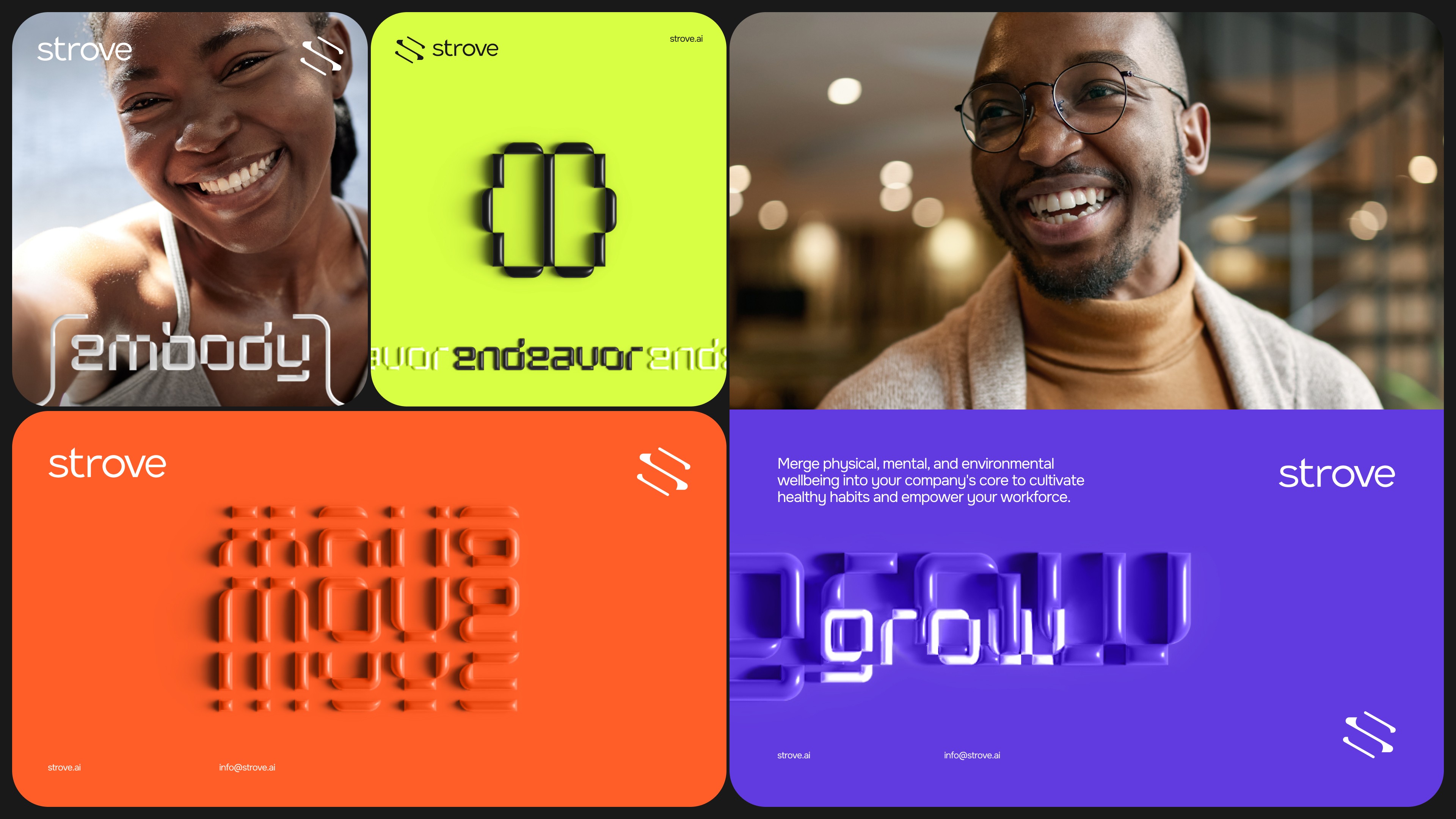
The brand refresh is inspired by the very meaning of the word "strove" - consolidating past actions and efforts to achieve great things. Driven by the relentless pursuit of progress and success, the change highlights our commitment and positioning as a modern, comprehensive, and client-centric employee health and wellbeing solution.
Wellbeing is a journey where almost every individual is at a different point, seeking fulfilment, balance, and optimal health in various aspects of life. The product needed to cater for everyone - those starting their journey and fitness enthusiasts. A combination of calming, dynamic, and active elements was implemented to instil a feeling of comfort, motivation and approachability. In addition to a modern and bold approach, the use of 3D inflated artwork, unique typography, iconography, and motivating visuals were necessary differentiating elements that set us apart from competitors.
Logo
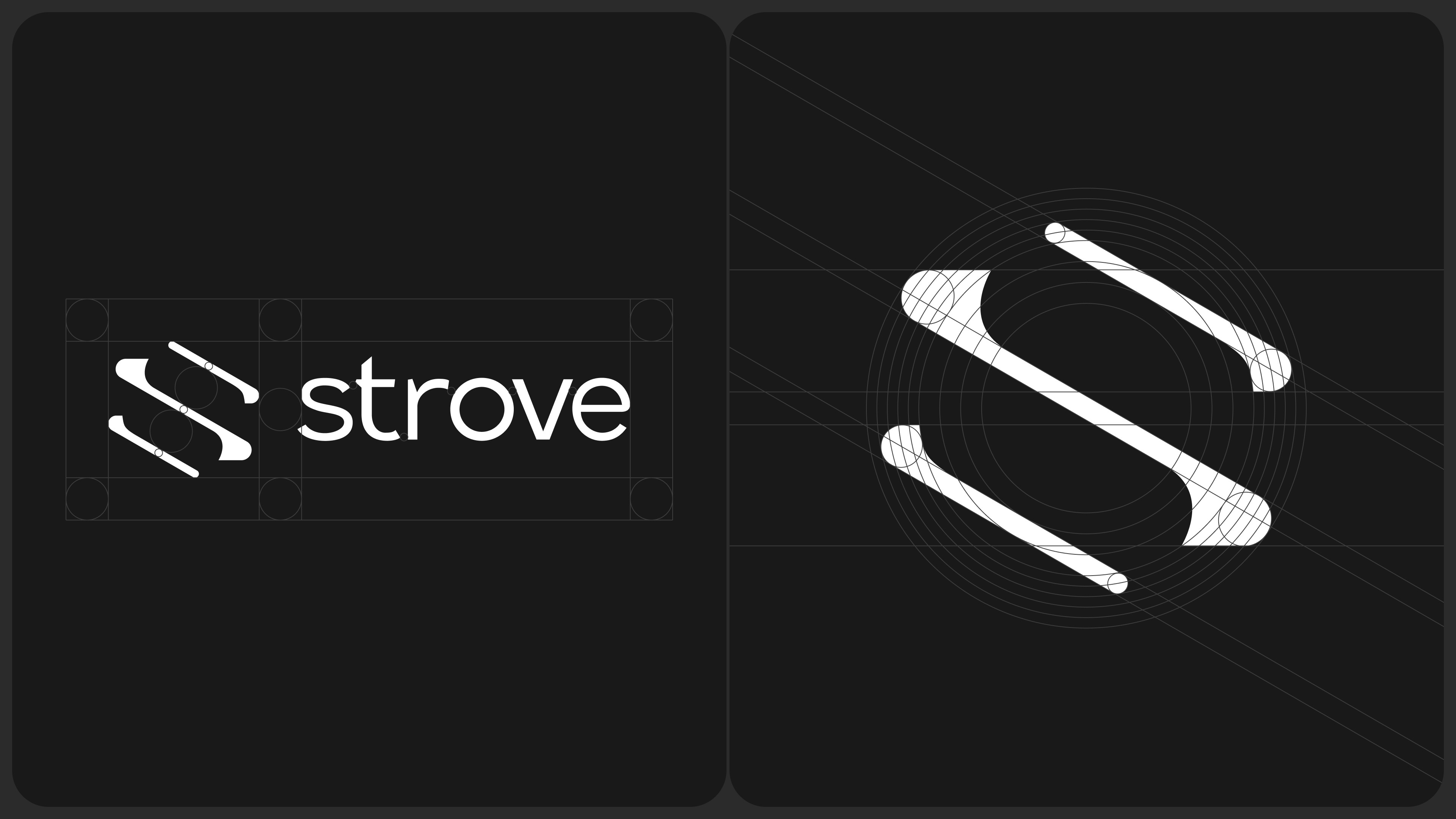
The rebranded logo was an evolution of more than twenty logo design concepts we explored. The process of turning the concept into reality saw us use various visual elements that would support our ideals: the sun, the moon, “the self”, wholeness, movement, progress, and of course, the letter ‘S’.
We needed the logo to be striking and memorable while showcasing a deeper meaning toward holistic health and wellness. The letterform of the final logo embodies the concept of endless motion around a sphere that reflects one’s journey toward a healthier and happier life.
Colour
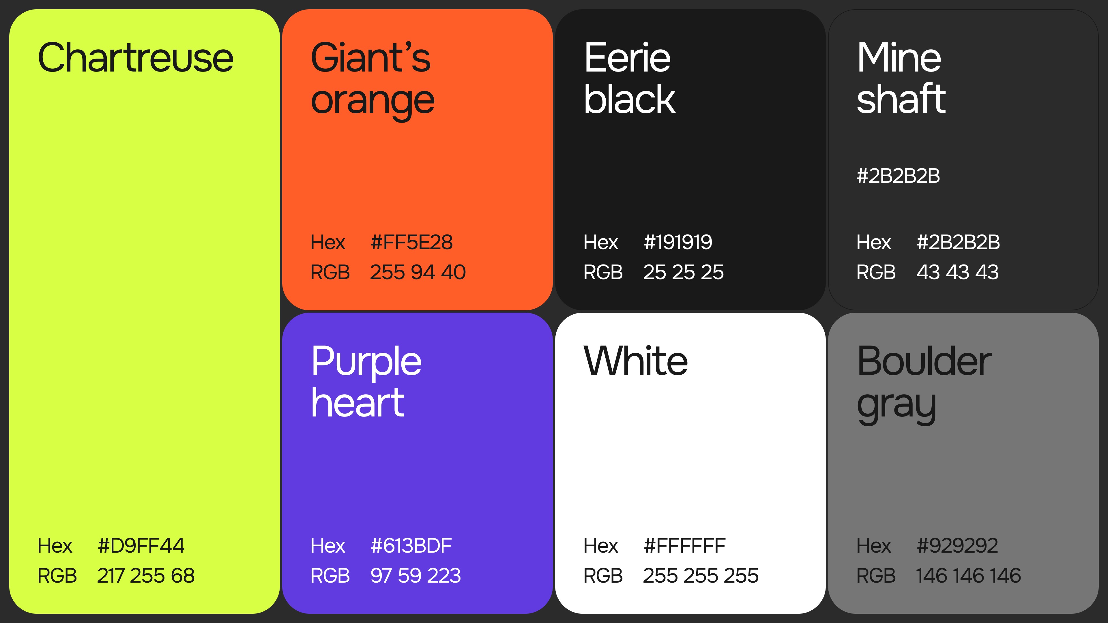
Our previous brand identity was most recognisable by the vibrance showcased through colour palettes and gradients. We wanted to maintain the vibrant appeal while introducing new, unique colours that set us apart from the competition. We are excited to adopt a new primary colour - Chartreuse. The bright and energetic colour is supported by a secondary palette that caters for the intensity of physical exercise and calming colours for mental wellbeing.
Typography
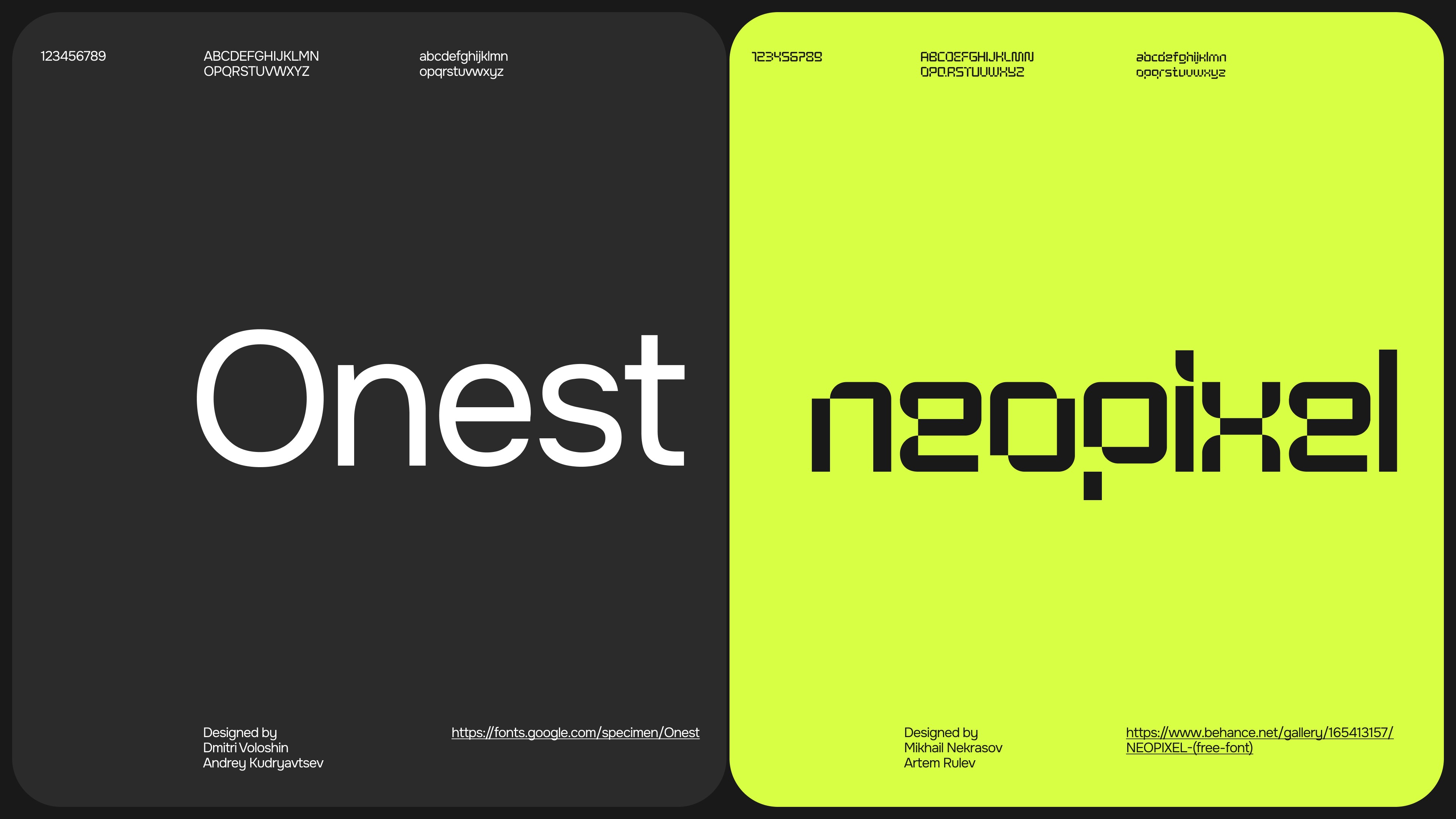
We aimed for a balance between two distinct yet complementary characteristics: calmness and excitement. The primary typeface, Onest, embodies a sense of calmness and human touch. On the other hand, the secondary typeface, Neopixel, exudes modernity, appeal, and excitement. Our objective was to steer clear of generic typography and opt for something unique and captivating. Understanding the importance of versatility in typography, the decision to adopt the fonts into our user interface was largely guided by clarity and ease of reading. Conversely, Neopixel takes the spotlight in our marketing materials, grabbing attention and evoking excitement among our audience.
Iconography
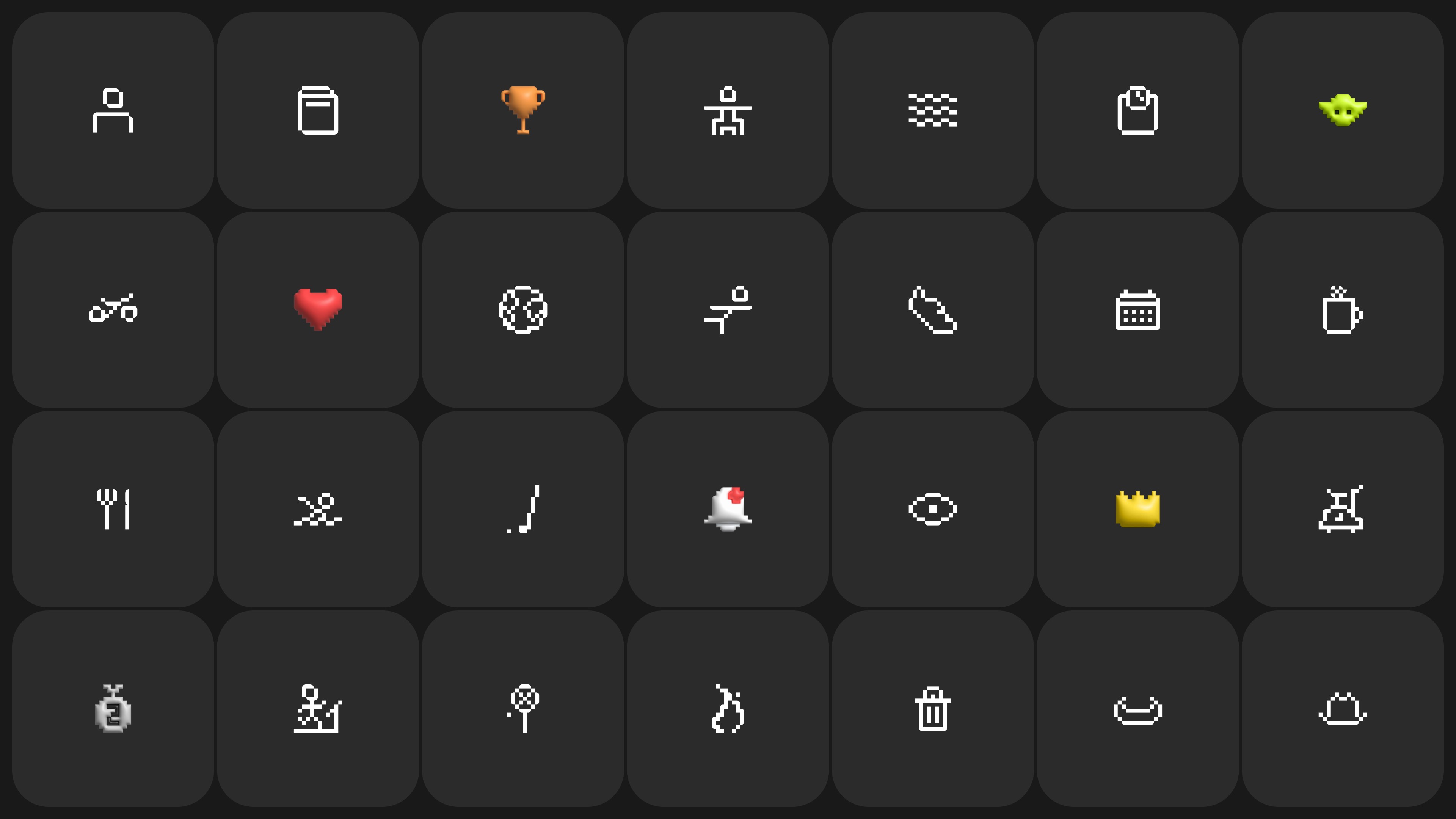
One of the distinctive features of our iconography is the "pixelated" style, which draws inspiration from our secondary typeface, Neopixel. Our iconography is designed to be unique and instantly recognizable, making it easier for users to identify and interact with our platform. We believe in infusing elements of fun into our brand without compromising professionalism. That's why we introduced gamified 3D elements to our iconography. Whether it's navigating through features or engaging with content, our icons provide a distinct visual cue that enhances user experience.
Imagery
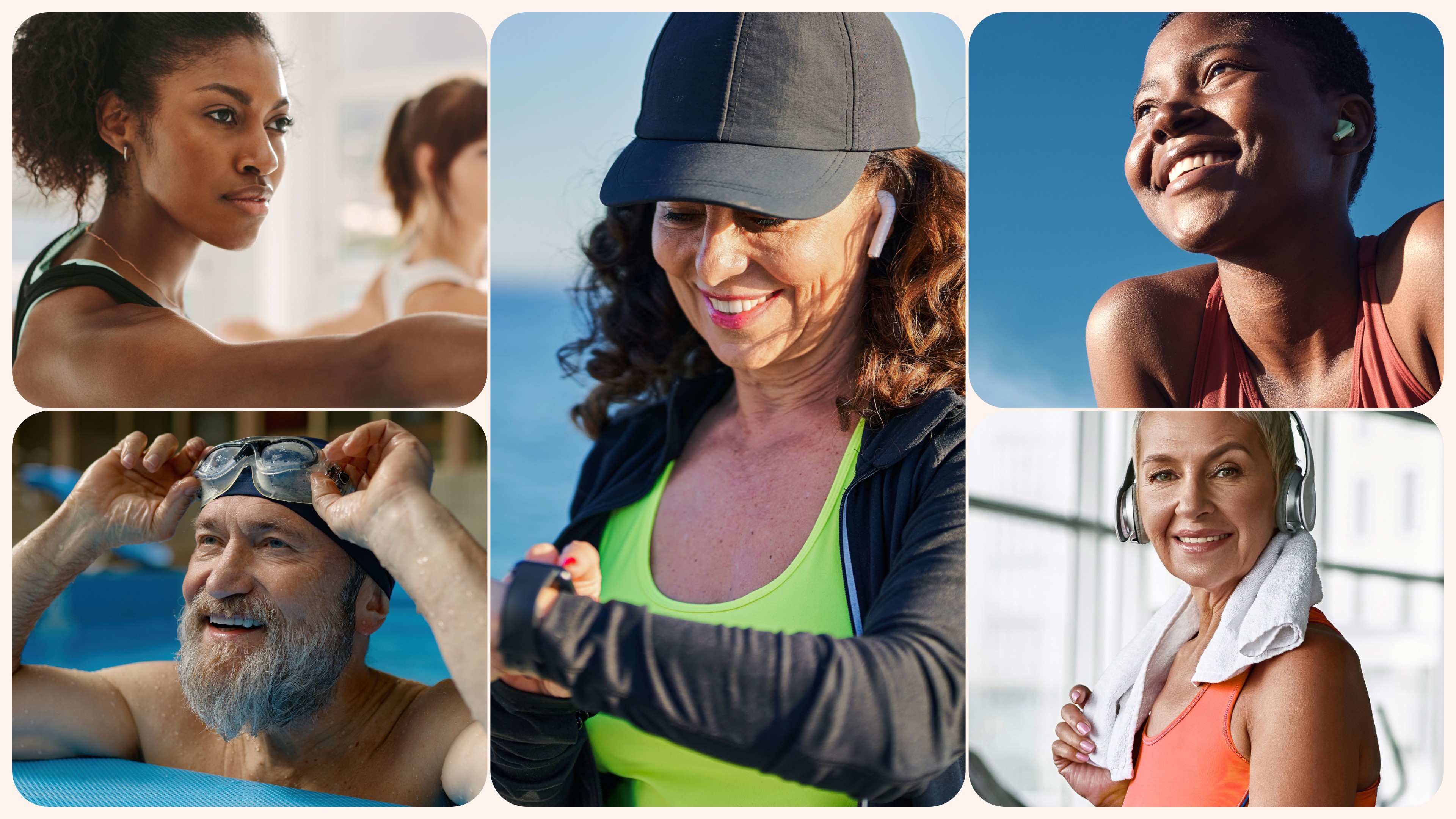
Our goal was to present a visual narrative that resonates with individuals of all ages and backgrounds while capturing the essence of vitality, diversity, and humanity. We believe in portraying real people, not perfect models, in aspirational settings that inspire viewers to embark on their own wellness journey. The imagery used often features close-up shots that capture personal moments and emotions. Emphasising holistic wellness, the imagery showcases activities and moments that contribute to overall wellness, whether it's engaging in physical exercise or practising mindfulness and self-care.
The finished product
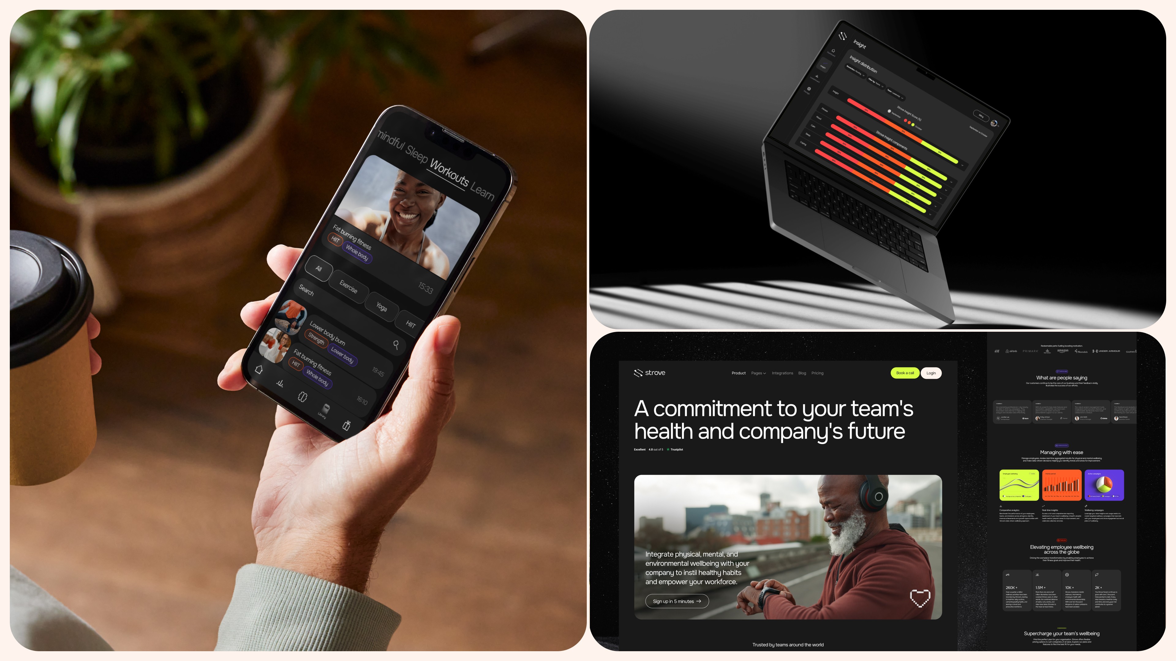
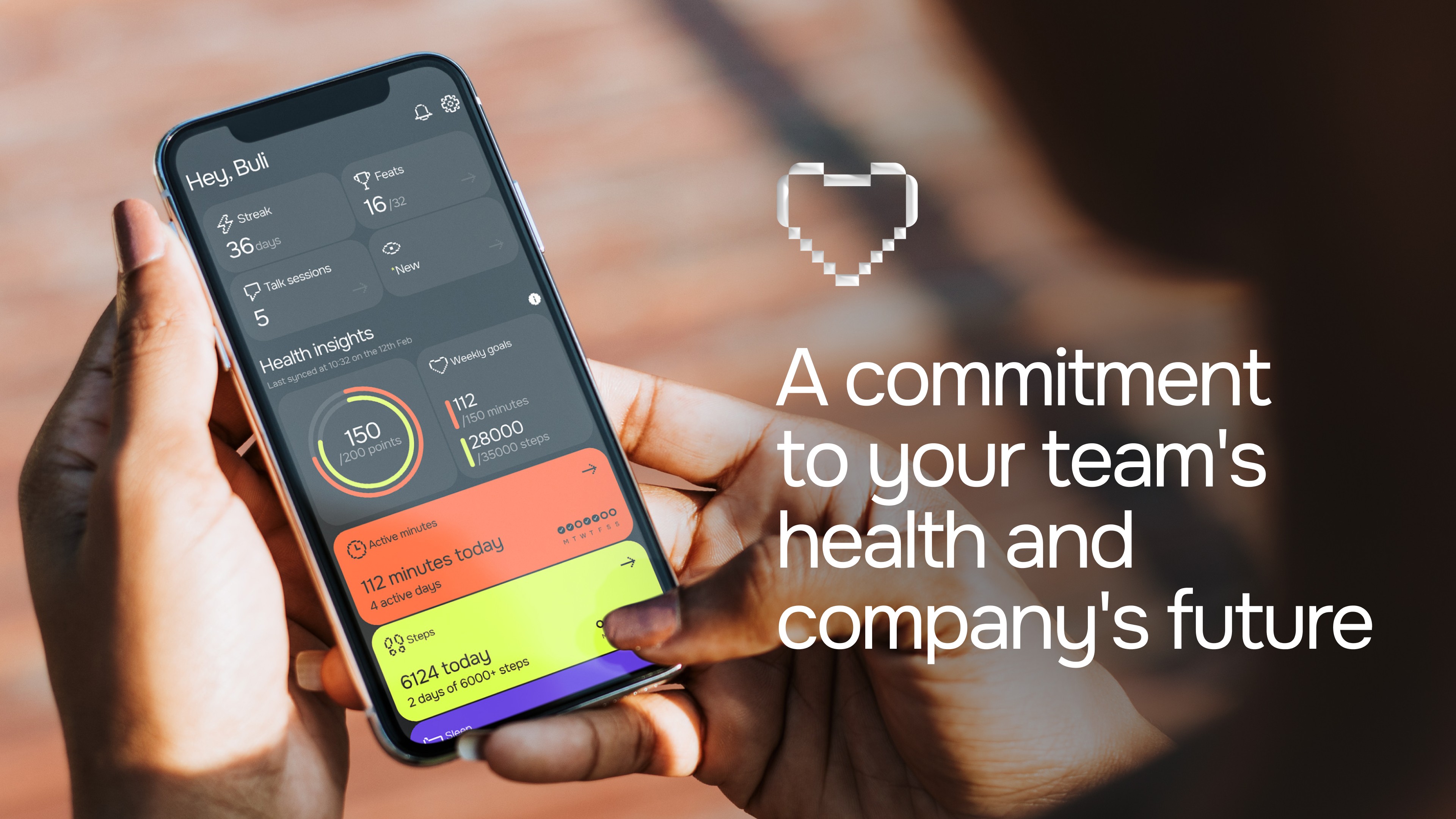
Of course, our public-facing platform needs to steal the show. By seamlessly integrating the design elements, we’ve elevated our platform to be the new standard for employee wellbeing. With our target audience in mind, the refreshed user interface delivers a fresh, modern, and accessible experience for all users.
Strove is more than just an employee wellness solution. It’s a commitment to your team’s health and company’s future.


